
Design to Production Process
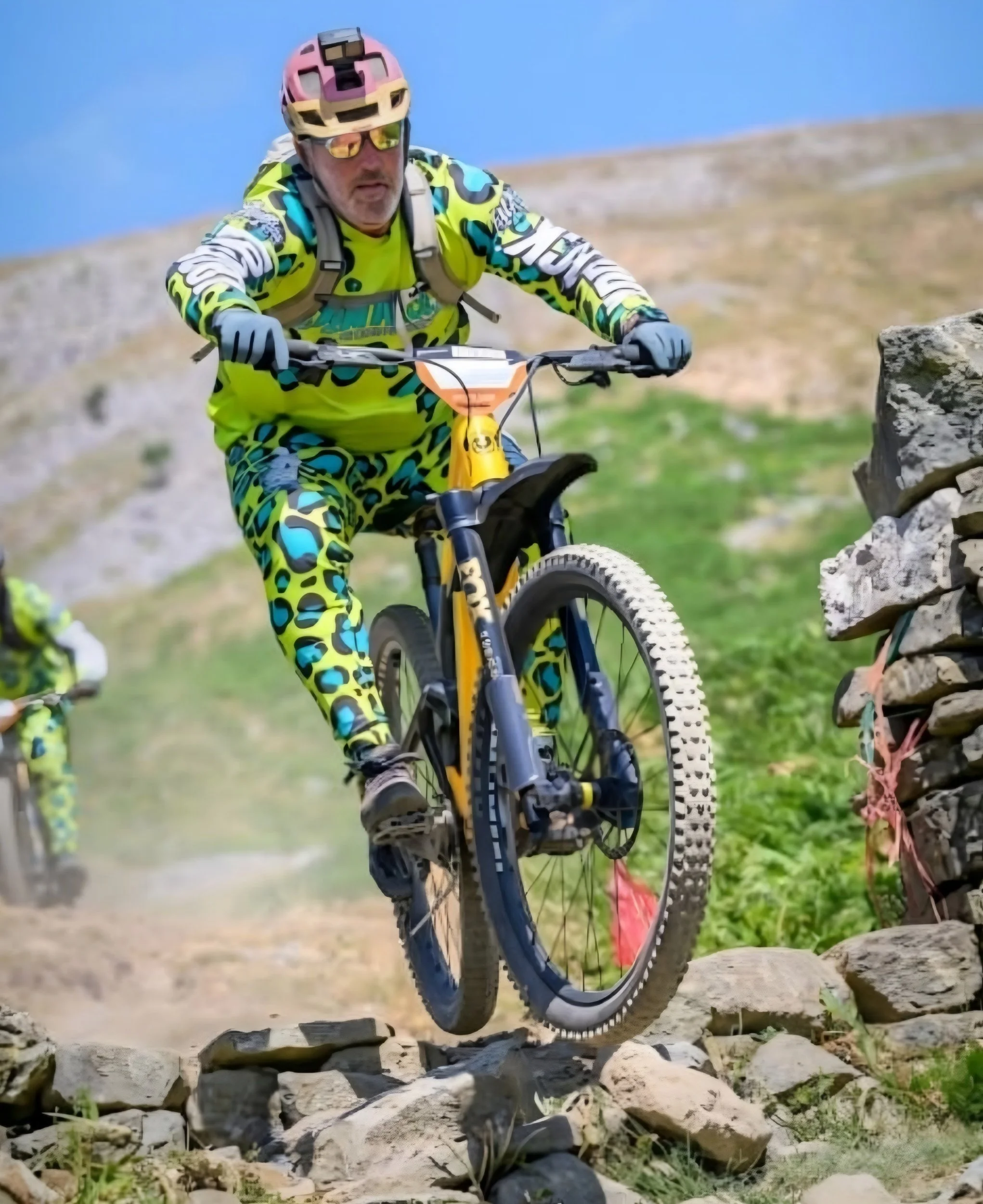
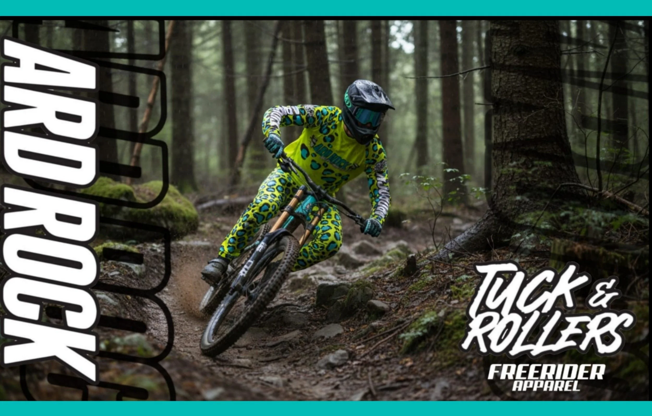
The "Ard Rock Tuck & Rollers" kit moved from initial conceptual sketches to the high-visibility, custom-sublimated final kit featured on the trails.
1. Concept & Palette Definition
The Brief: Create an unmissable, high-energy race kit designed specifically for the Ard Rock event. Brief was to feature a wild colourful animal print look that would stand out on photos and be a talkimg point at the event. I have worked with Tuck & Rollers on previous projects so had a good feel for what they like.
They wanted to balance a bold look with function. All design work from initial designs sketches or a text brief os a one to one interactive process we complete through WhatsApp or other messaging services. I am given a brief from each customer and I mock up those ideas in photoshop so you can visualize them. We then work through and changes you would like to see before agreeing the final design
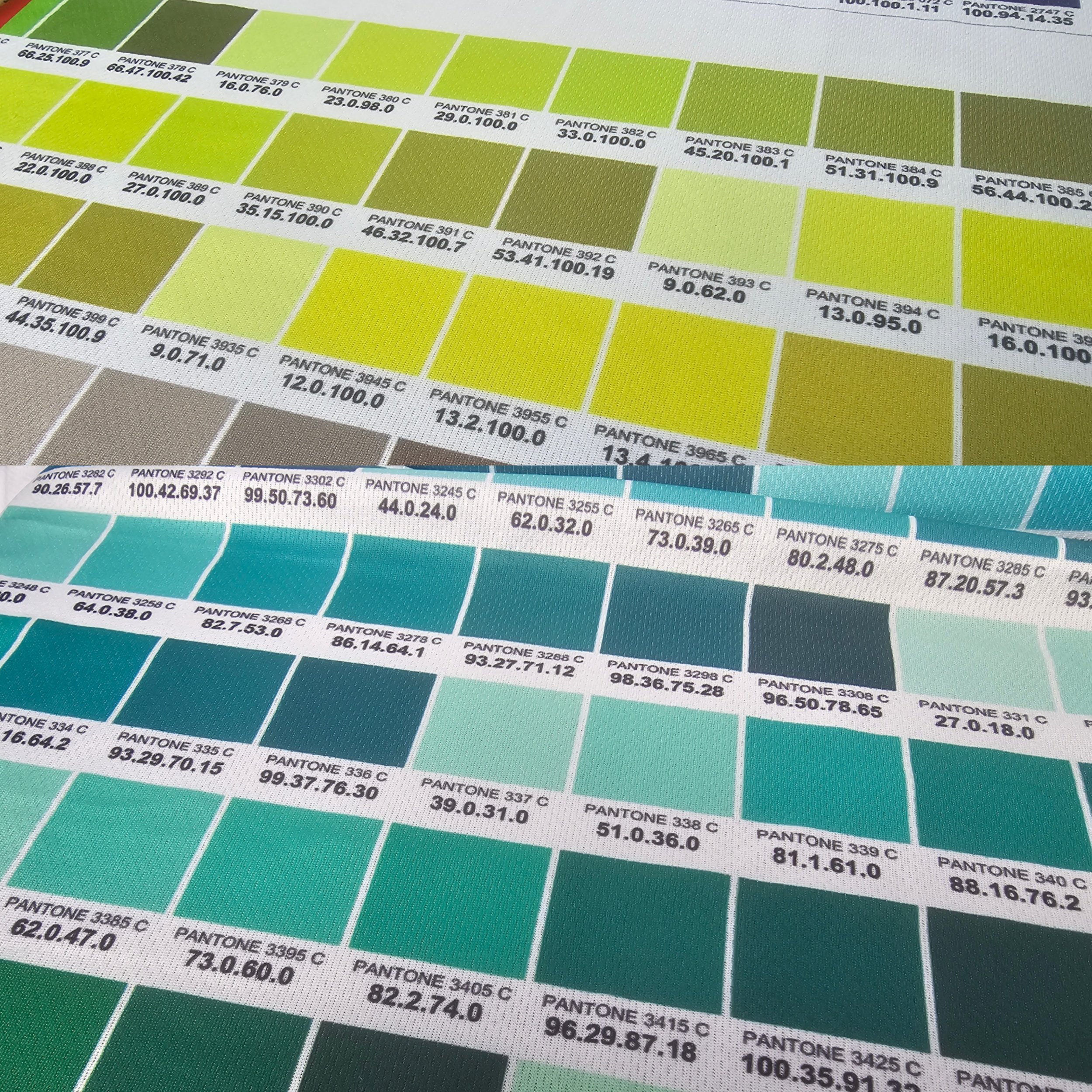
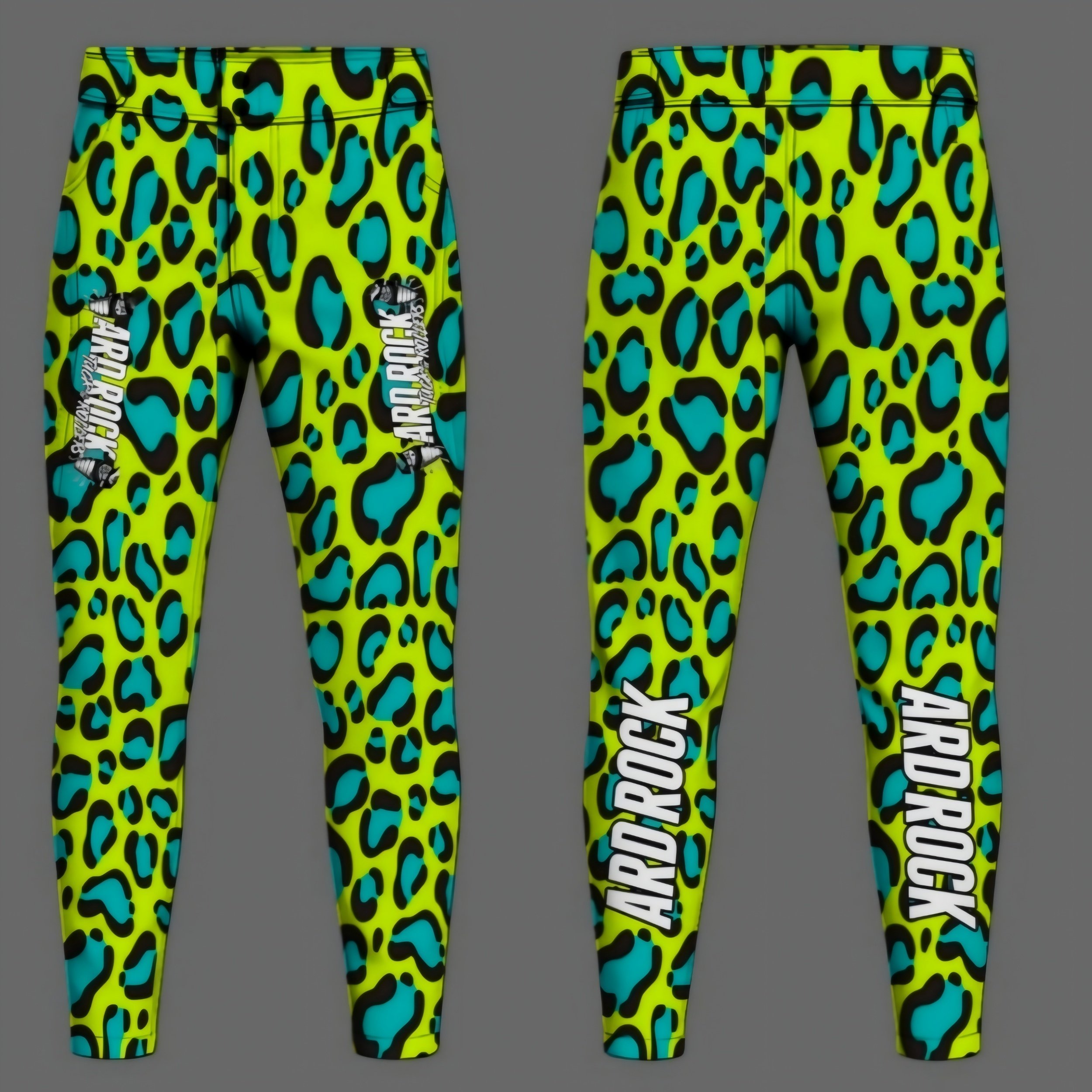
Color Selection: The foundation started with a high-vis electric neon yellow, contrasted against deep teal/cyan blue and heavy black outlines to ensure maximum visual pop against natural trail backdrops
2. Pattern Development & Branding Integration
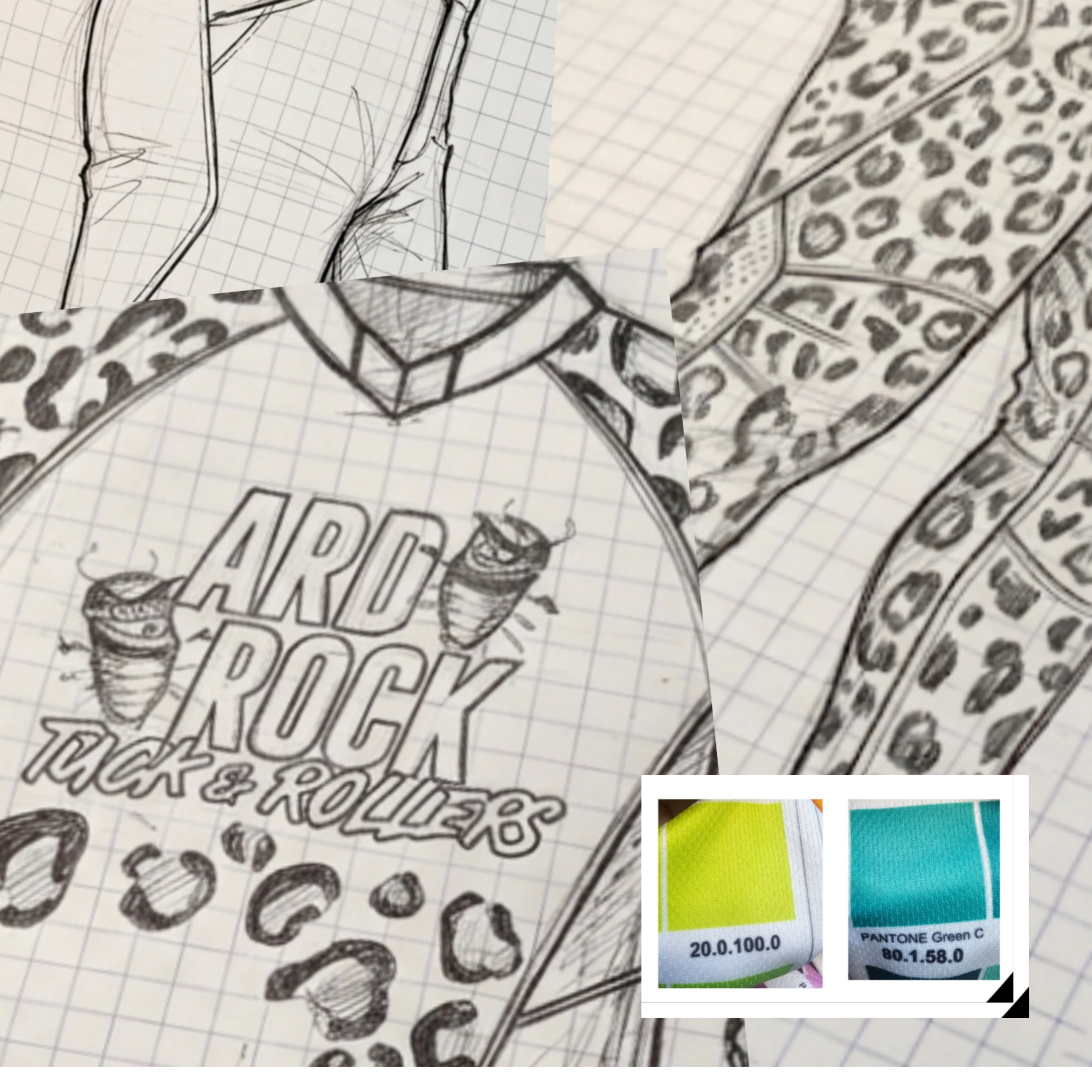
Leopard Print Motif: The core visual driver was a organic, stylized leopard pattern. Early layout sketches explored fading the print across panel transitions—wrapping heavily around the limbs, shoulders, and lower torso while leaving space on the chest and back for primary branding.
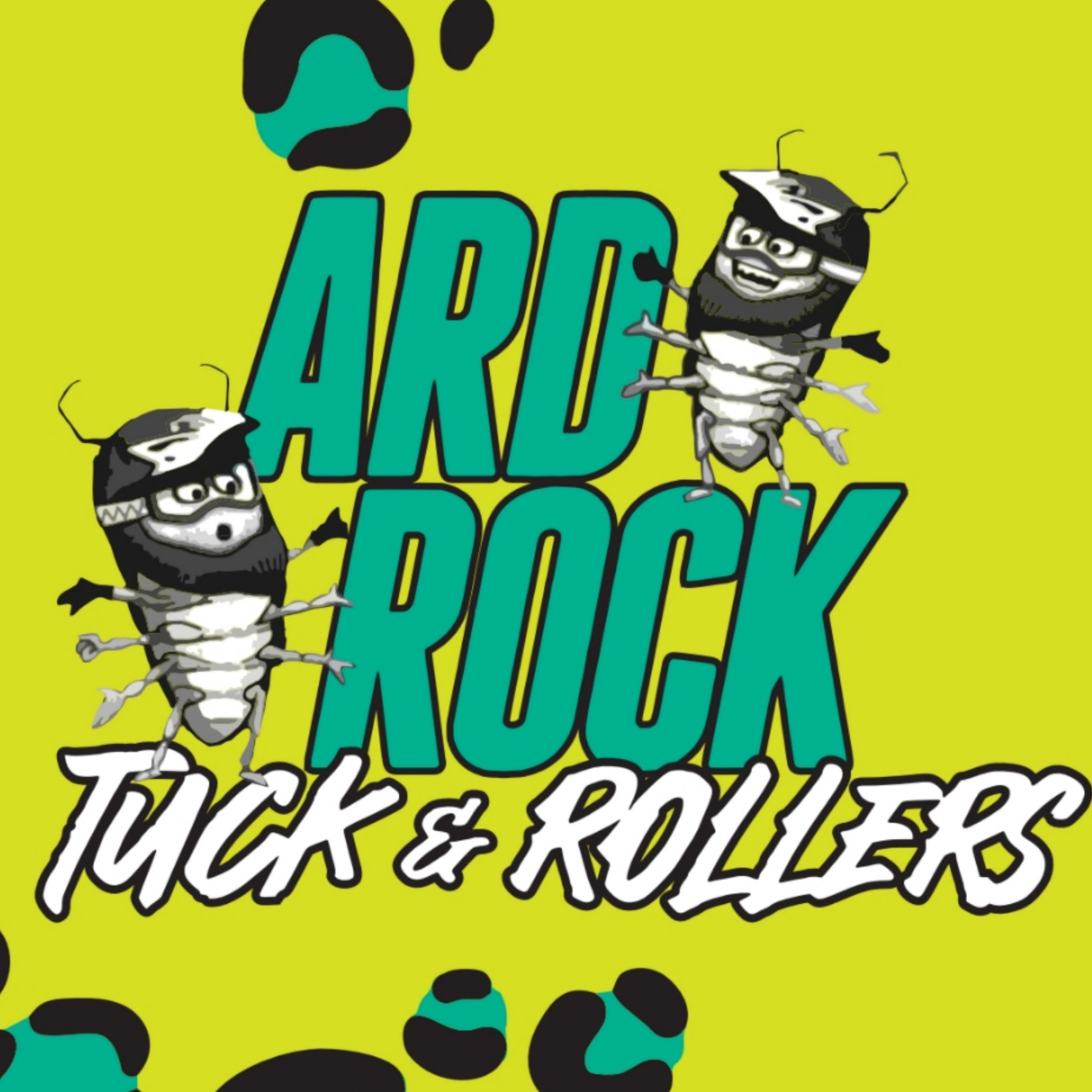
Mascot & Typography: The typography was sketched as heavy, blocky, angled lettering ("ARD ROCK") paired with script ("Tuck & Rollers"). The woodlouse/bug mascot illustration was positioned centrally on the chest and upper back to anchor the team identity.
3. Flat-Lay Vector Template & Seam Alignment
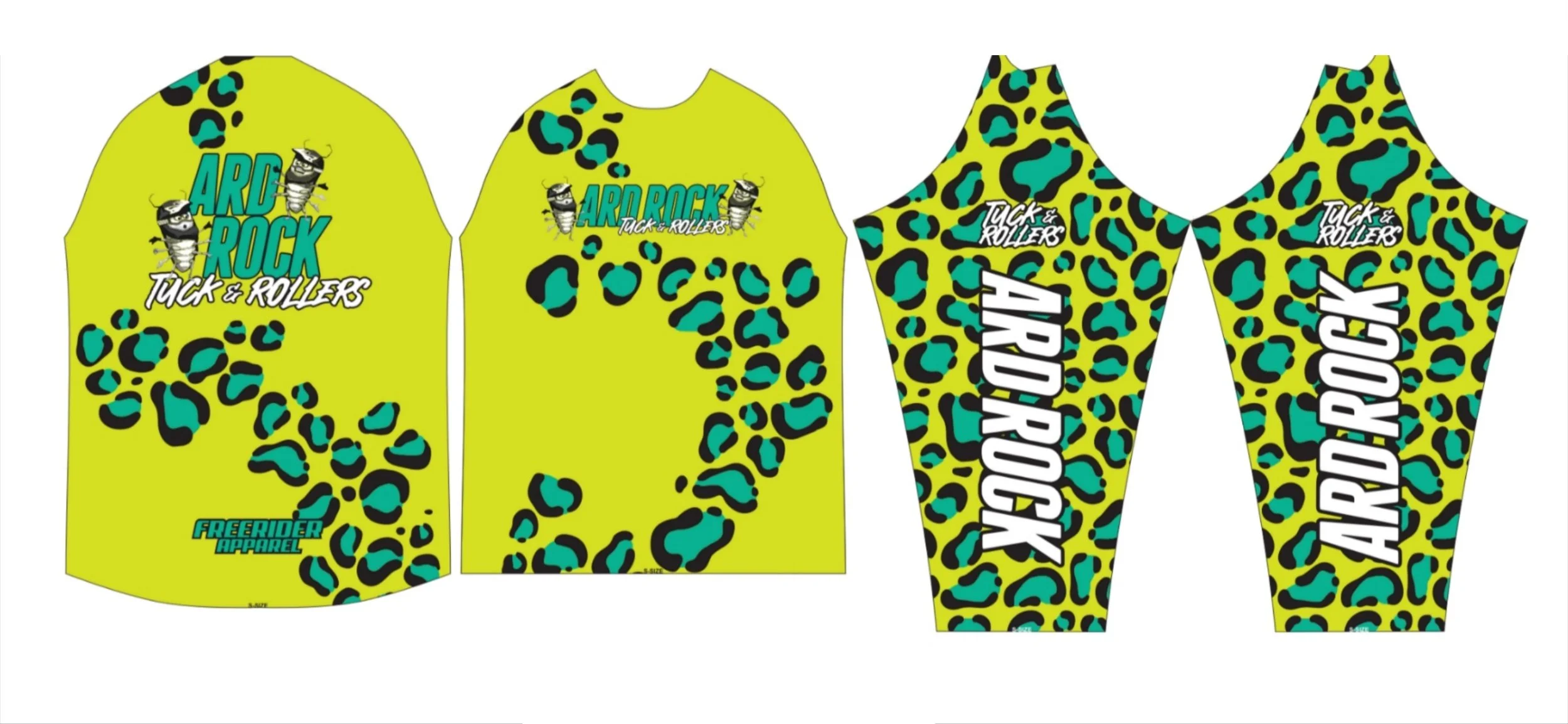
Panel Layout: Translating the rough sketches onto technical 2D flat-lay templates (jersey sleeves, body panels, and ride trousers) required mapping the leopard pattern across seam joins. All work at thos stage is rendered into scaleable vector artwork to maintain the highest quality finish to the print
Sleeve Legibility: Vertical typography was dropped down the full length of both outer sleeves to ensure sponsor/team visibility while the rider is in a attack position on the bike.
4. 3D Digital Rendering to Final Dye-Sublimation
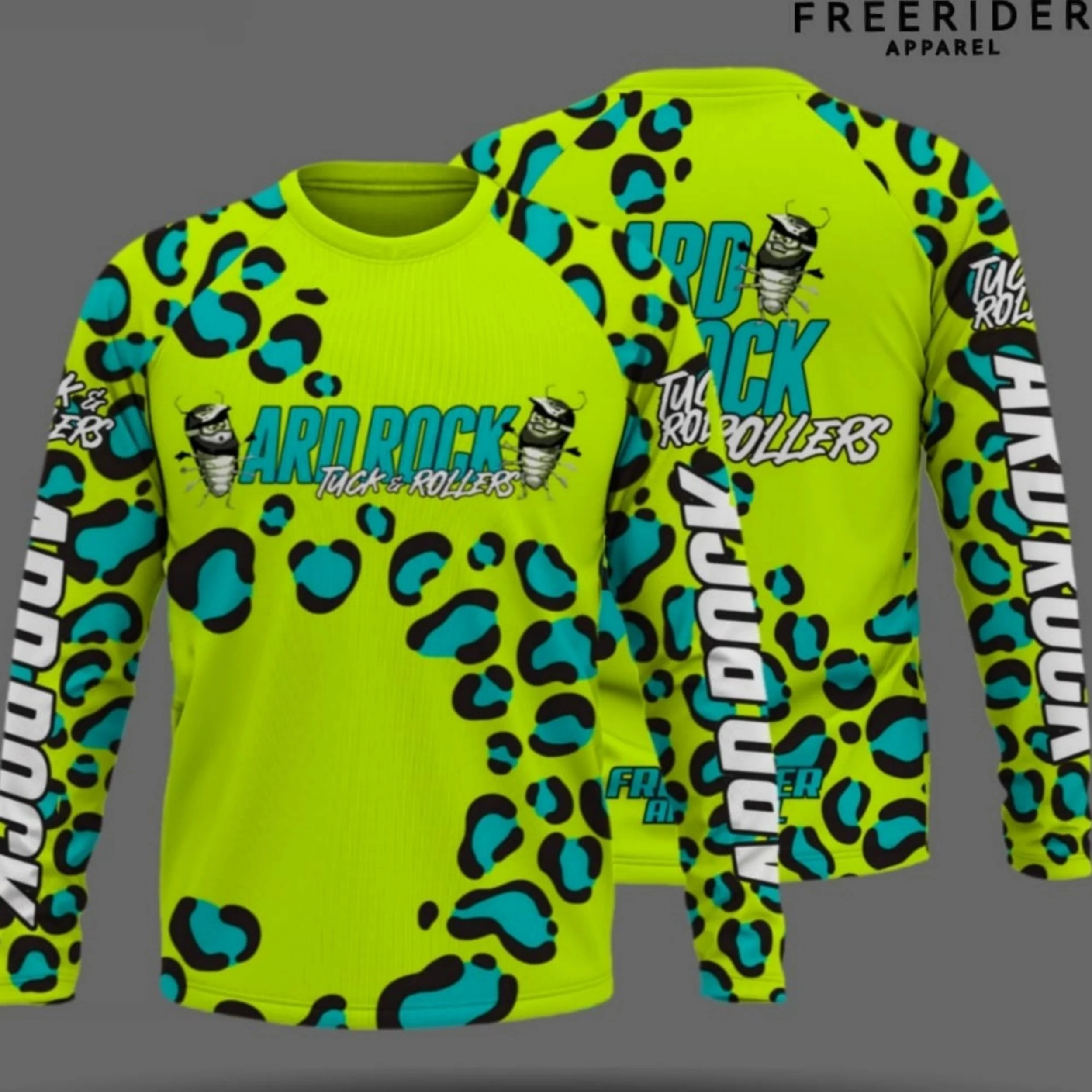
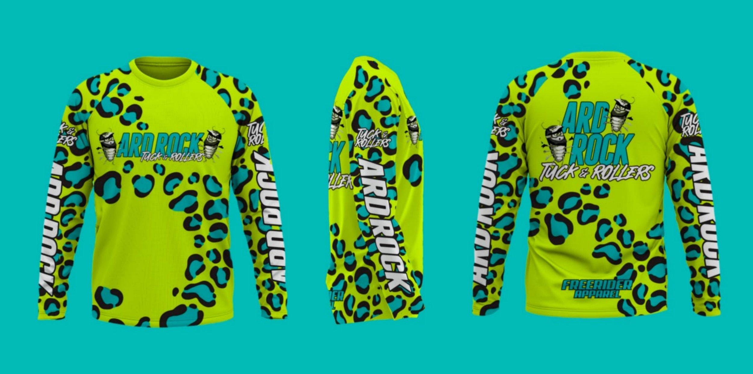
Digital Mockup: Complete vector graphics were mapped onto 3D models to check perspective, sleeve alignment, and rear visual impact.
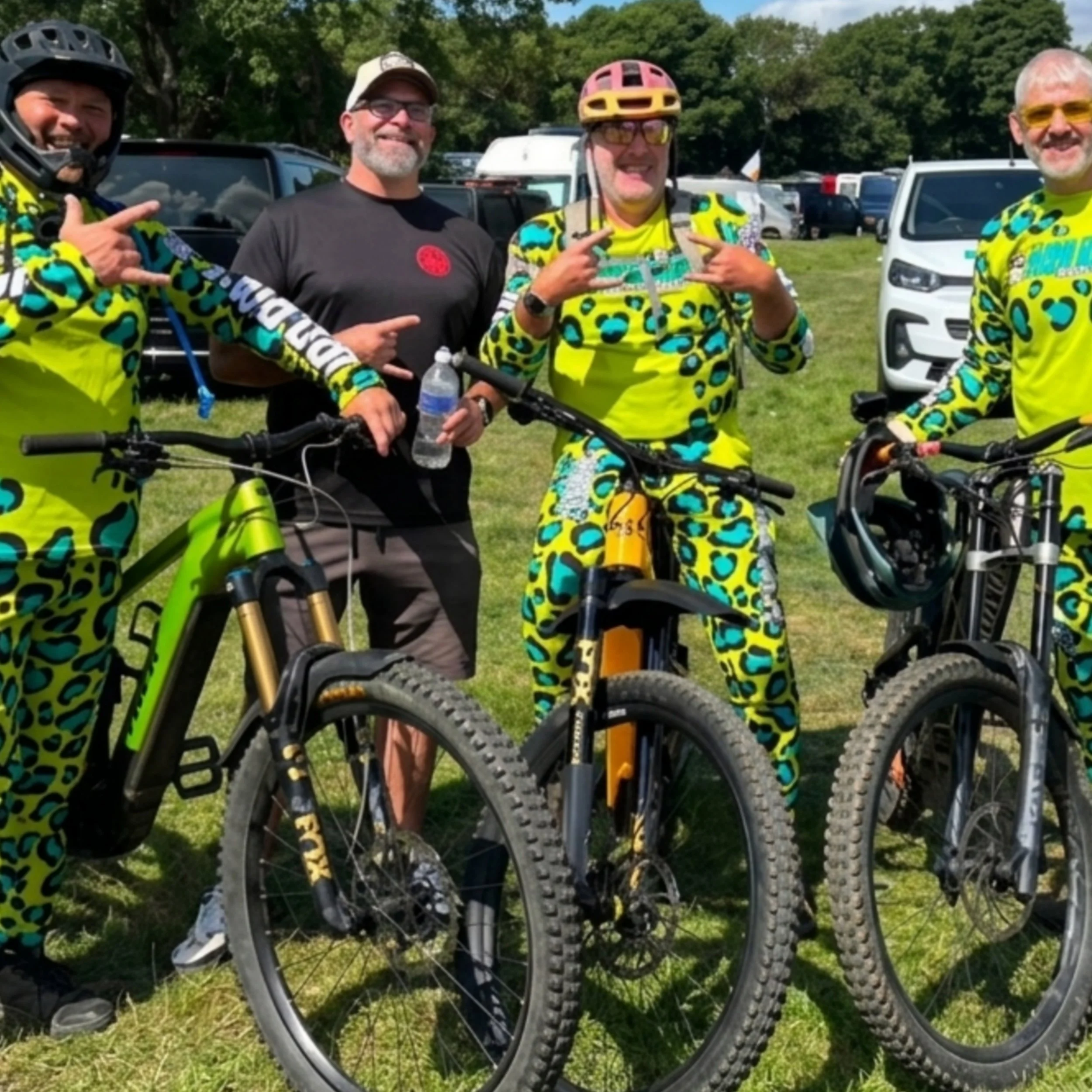
Production: Once approved, the artwork was transferred to performance fabrics via full dye-sublimation, locking in the neon teal and yellow hues before final stitch assembly.
4. Delivery turnaround
Delivery: Process turnaround approximately 3 weeks from agreement and and changes to designs you need.
Contact me for a chat or if you are ready to put your design ideas into reality
There are no minimum orders on team kits or jerseys
Thanks for taking the time to read
Shaun Evans
Freerider Apparel
07597 656567